Unexpected, Authentic, Bespoke
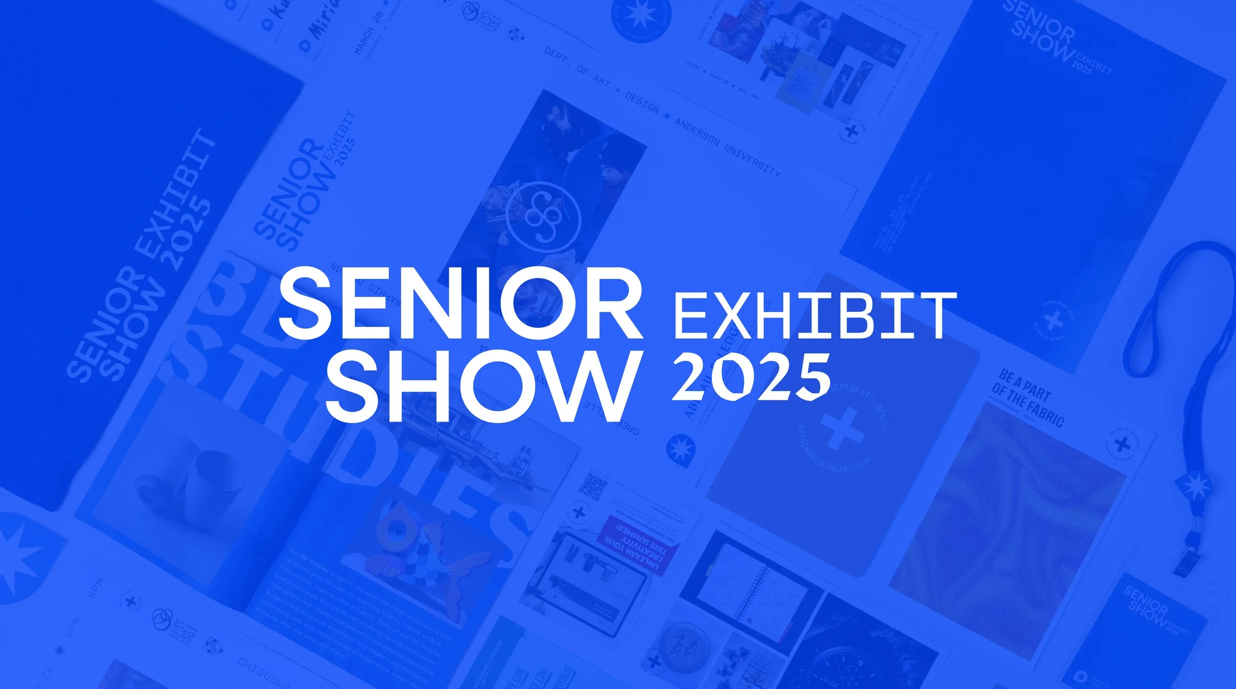
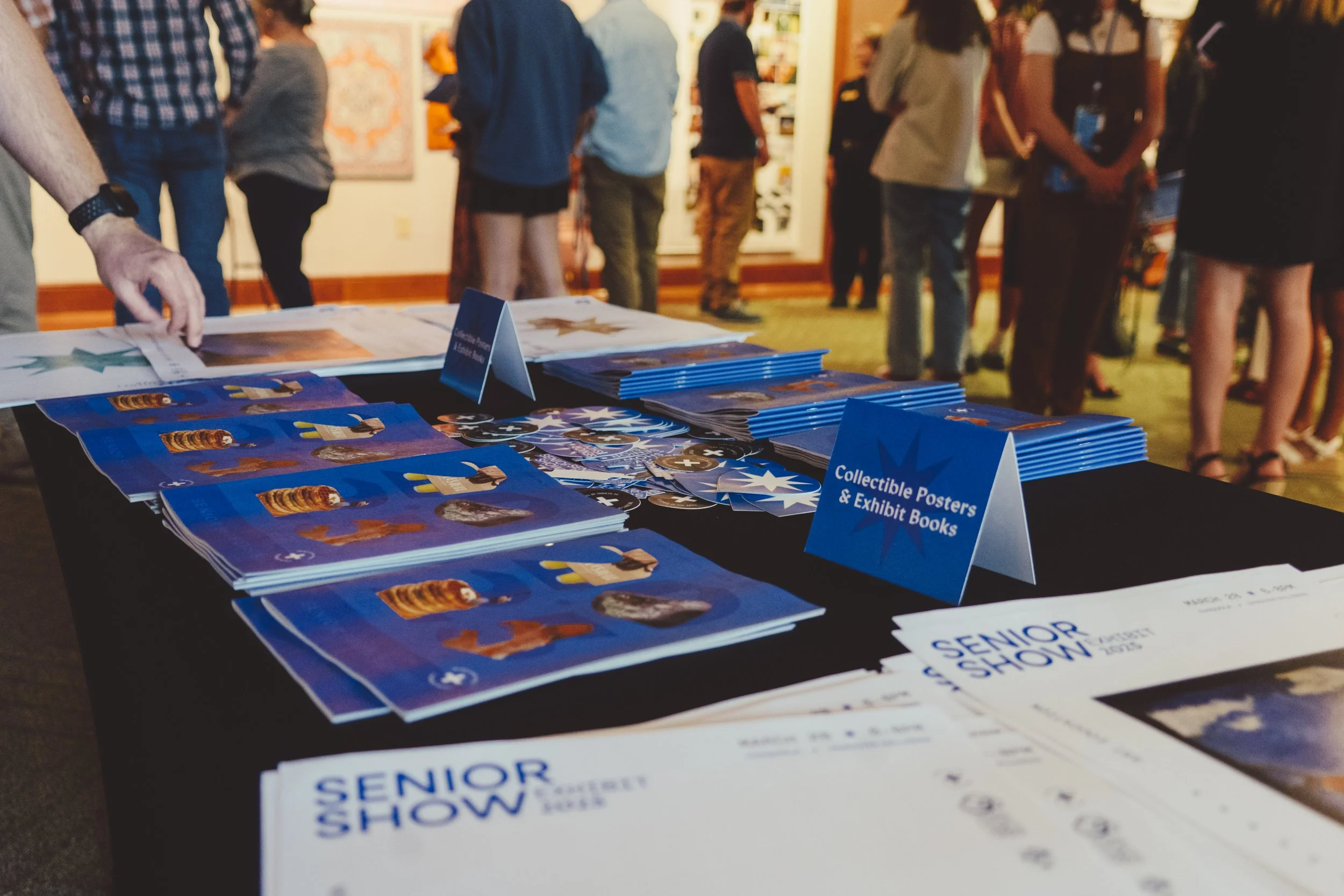
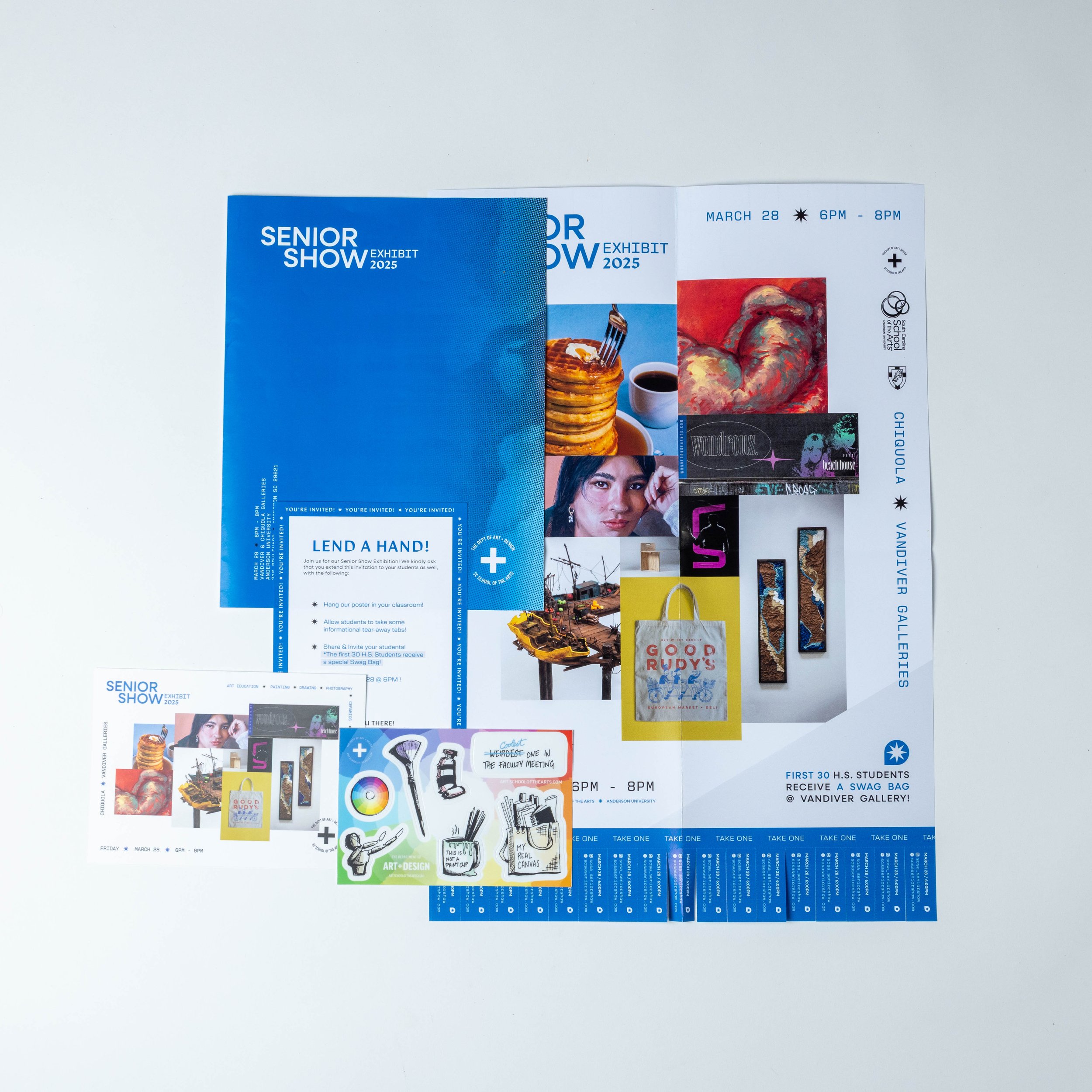
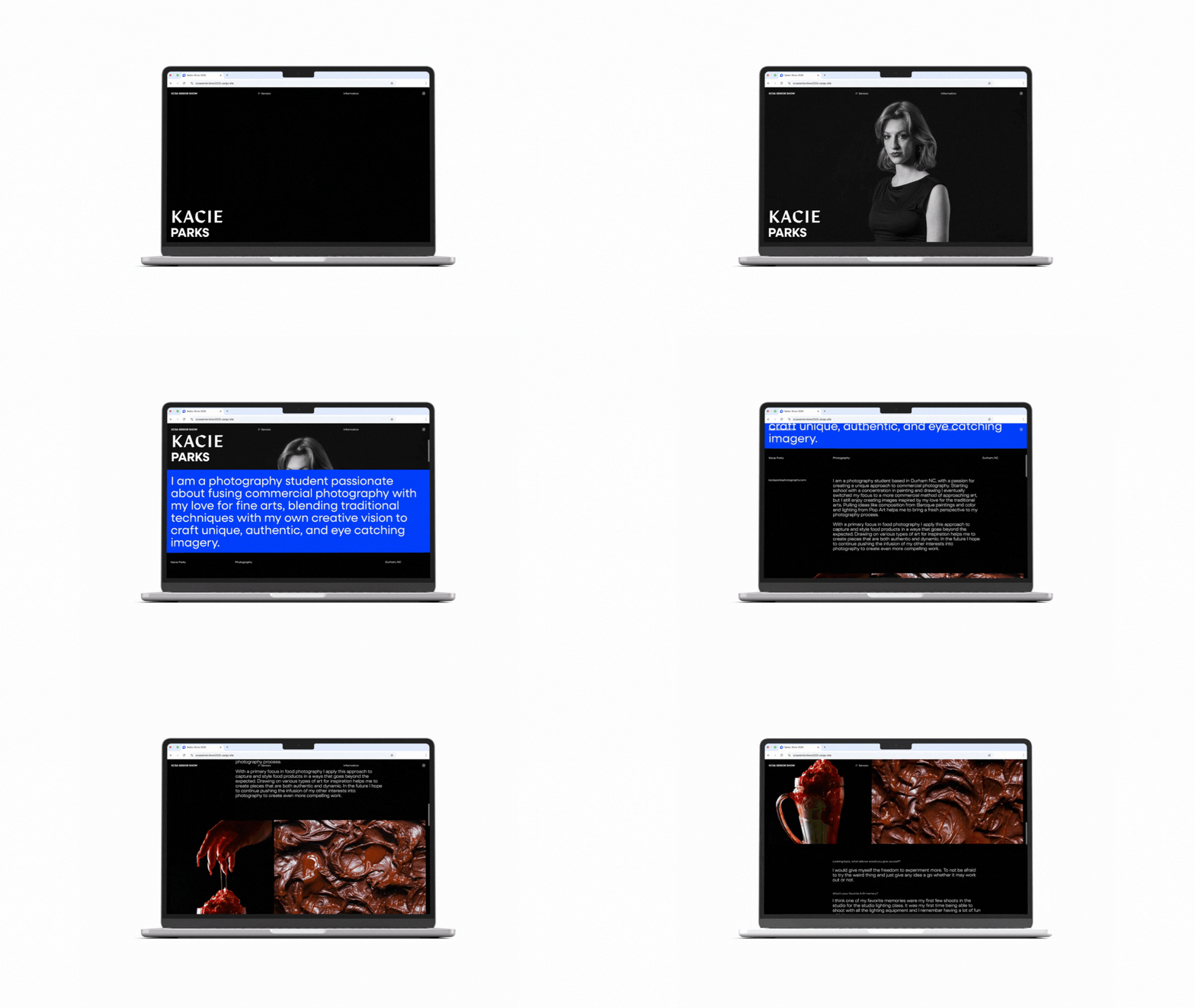
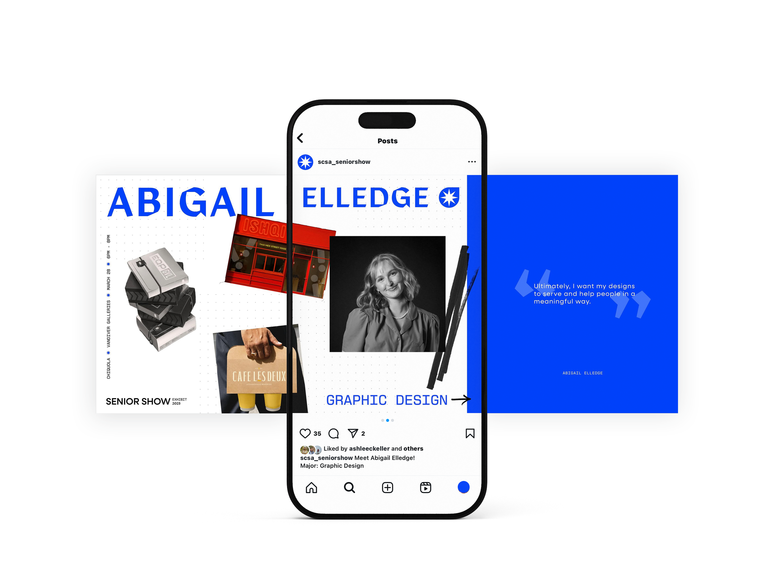
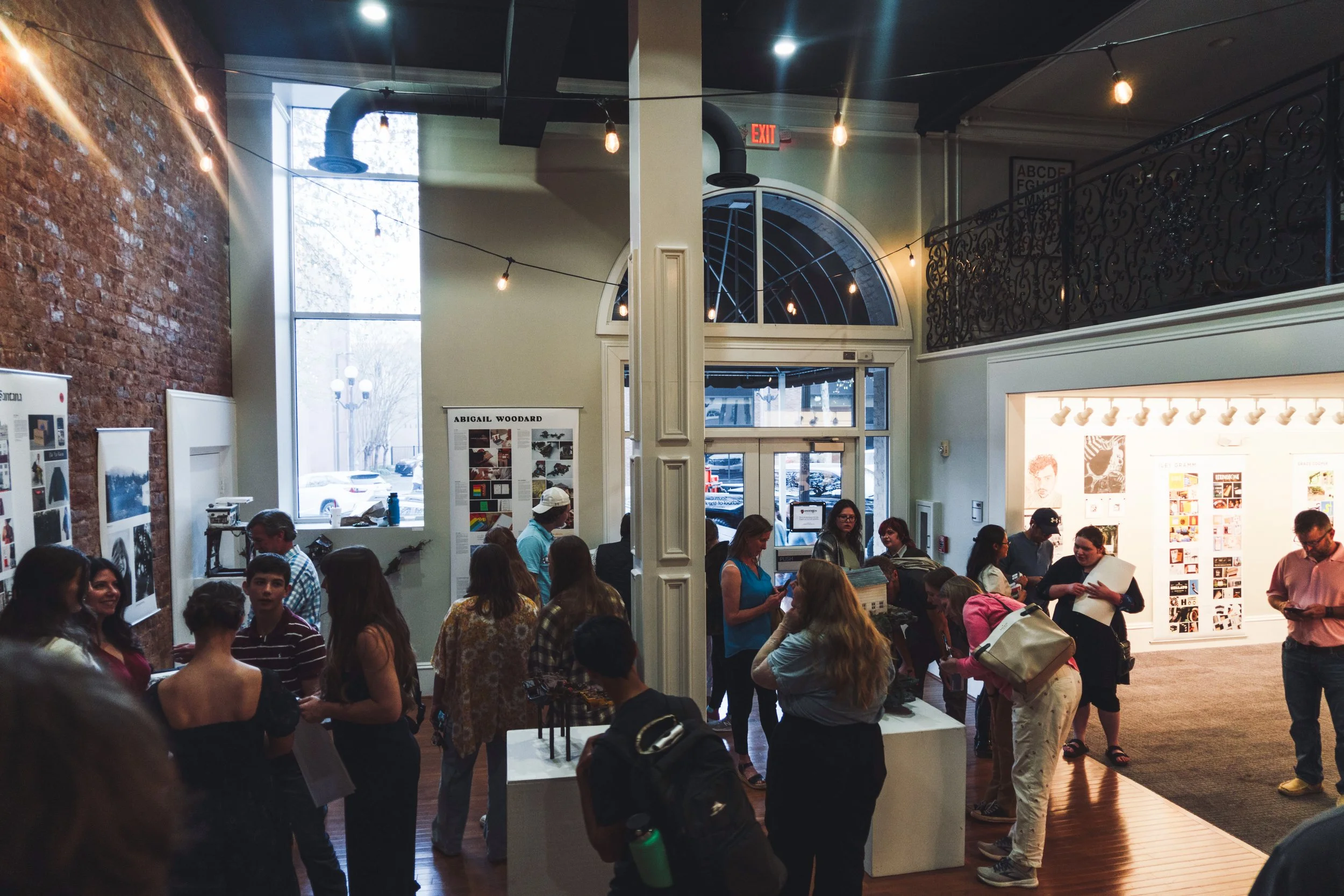
The SCSA Department of Art+Design Senior Show was a cohesive brand identity and marketing campaign designed and produced by our in-house design studio, PlusCo. As a multi-day, cross-disciplinary event, Senior Show exists as both a celebration of graduates as well as a public facing expression of the quality and caliber of the SC School of the Arts. With such diverse audiences in mind, Senior Show necessitates a sense of quality and meaning, while still cultivating a sense of pride among existing students.
Brand Identity
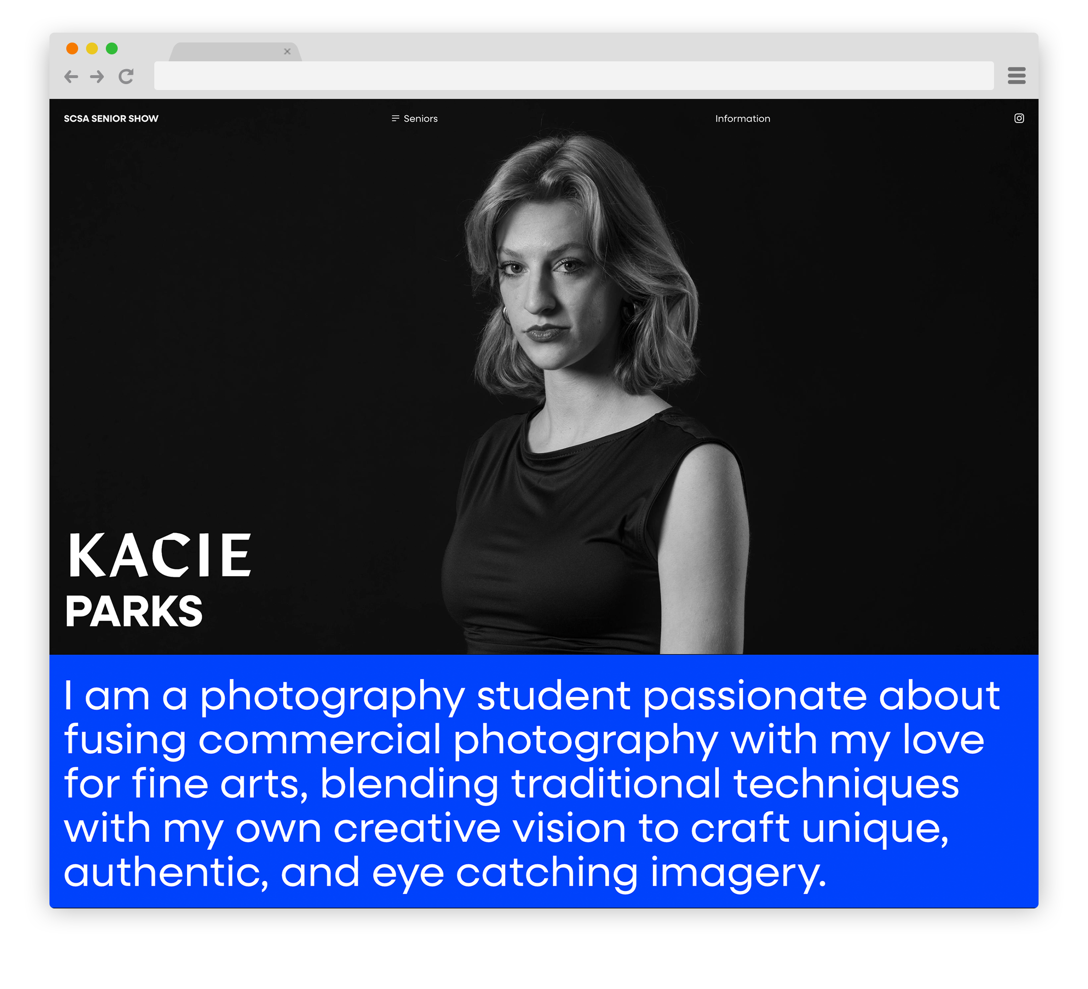
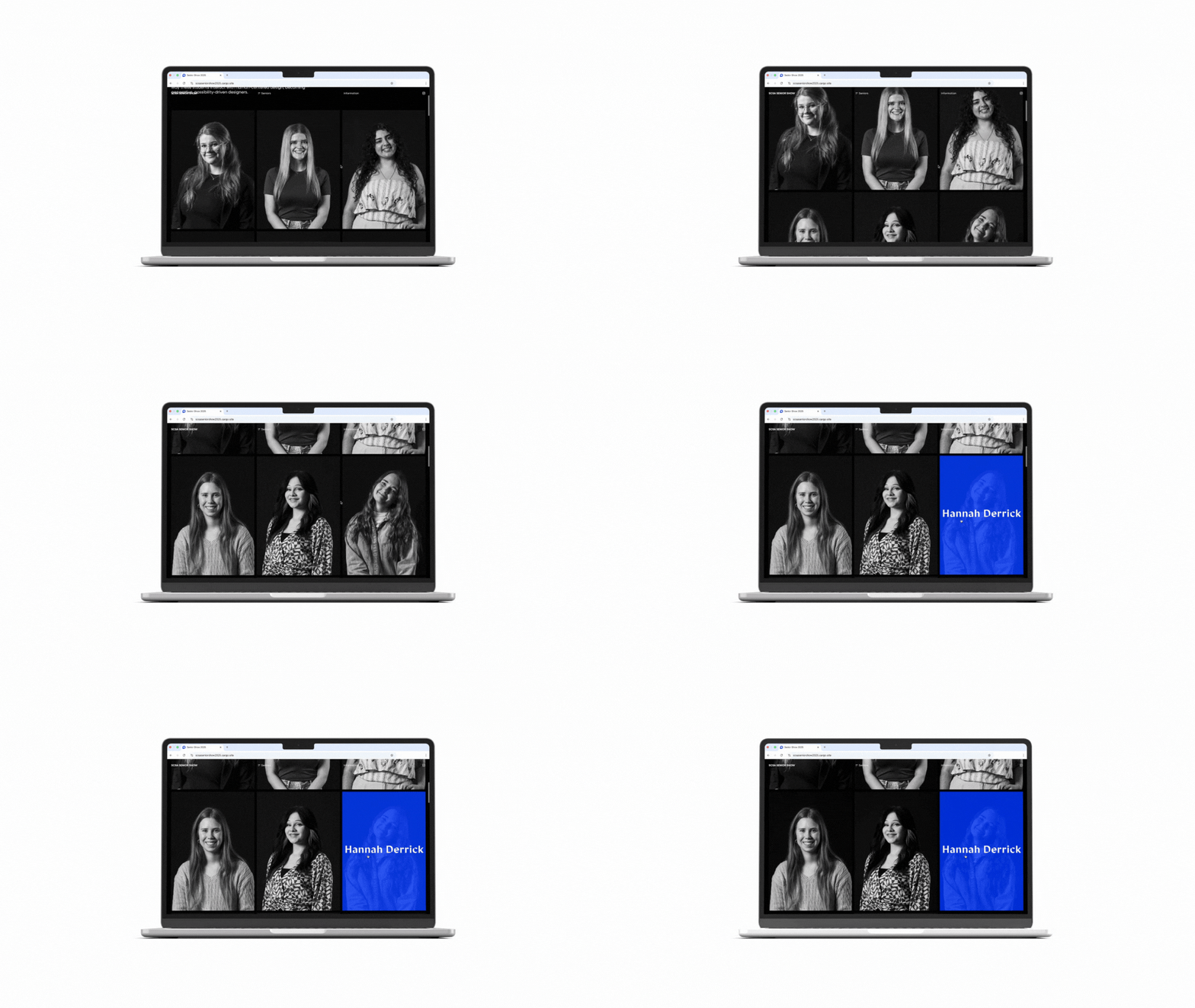
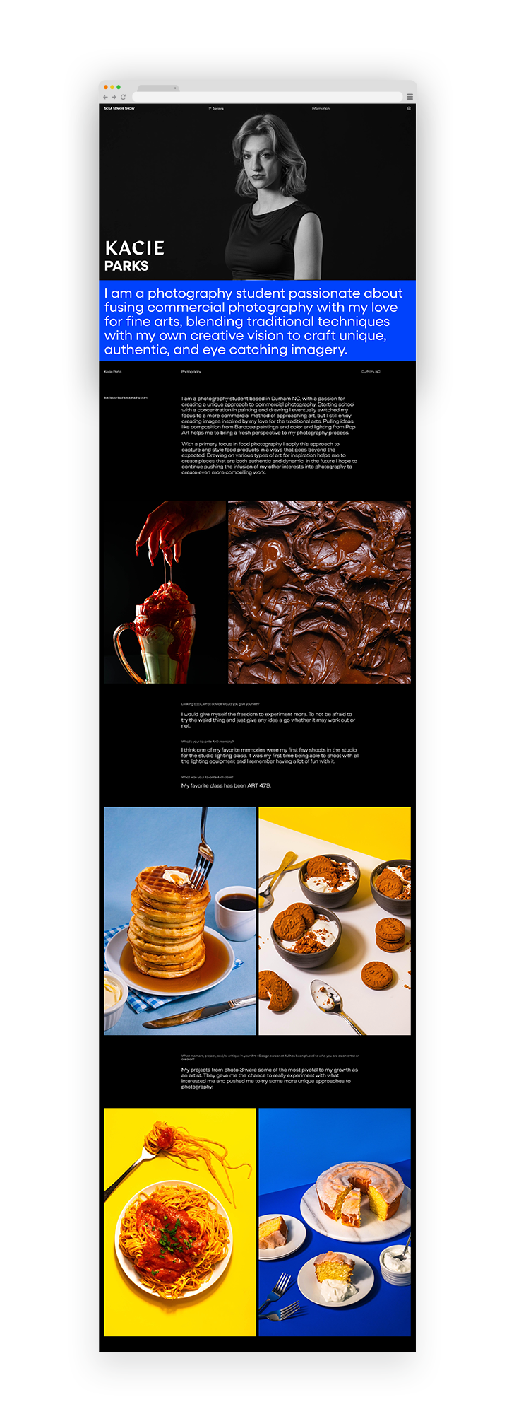
Website Design
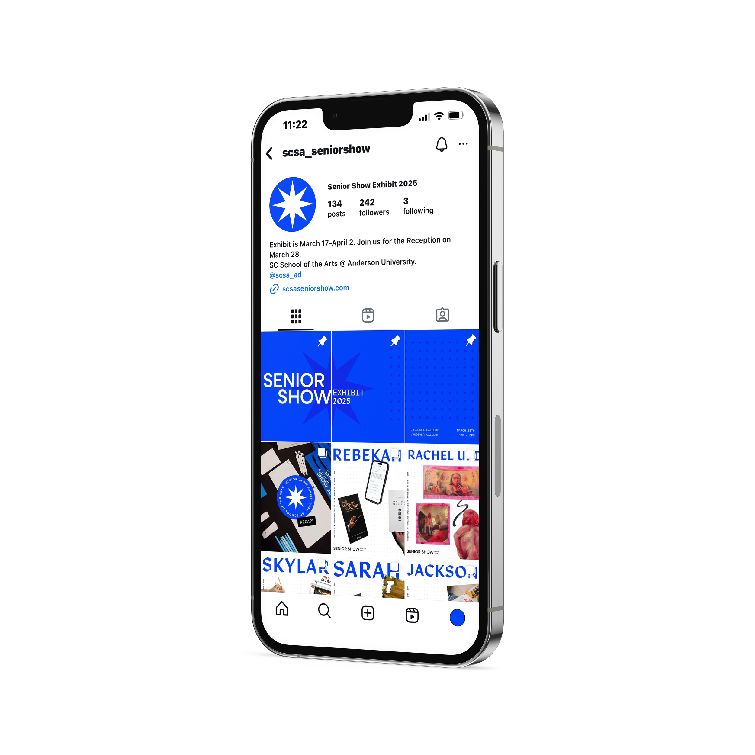
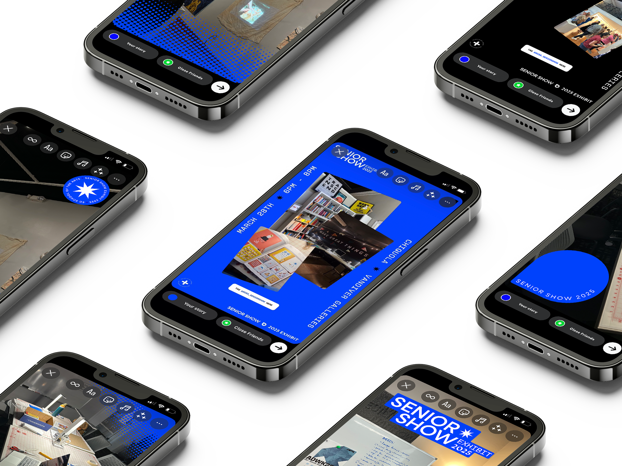
Campaign
Collaborators:
Iley Gramm, Lily Gregory, Kaitlyn Lian, Tabby Lo, Ethan Wright
Creative Direction:
Luke Anspach
Historically, the Department of Art+Design has been colloquially known as “the best kept secret” in the art & design higher education community and at Anderson University. Though this is a celebratory statement, it poses a challenge of not truly being known to external audiences, hindering our connection beyond the university campus. This became the overarching challenge to address in the establishment of a new identity for the Senior Show Exhibit.
Problem
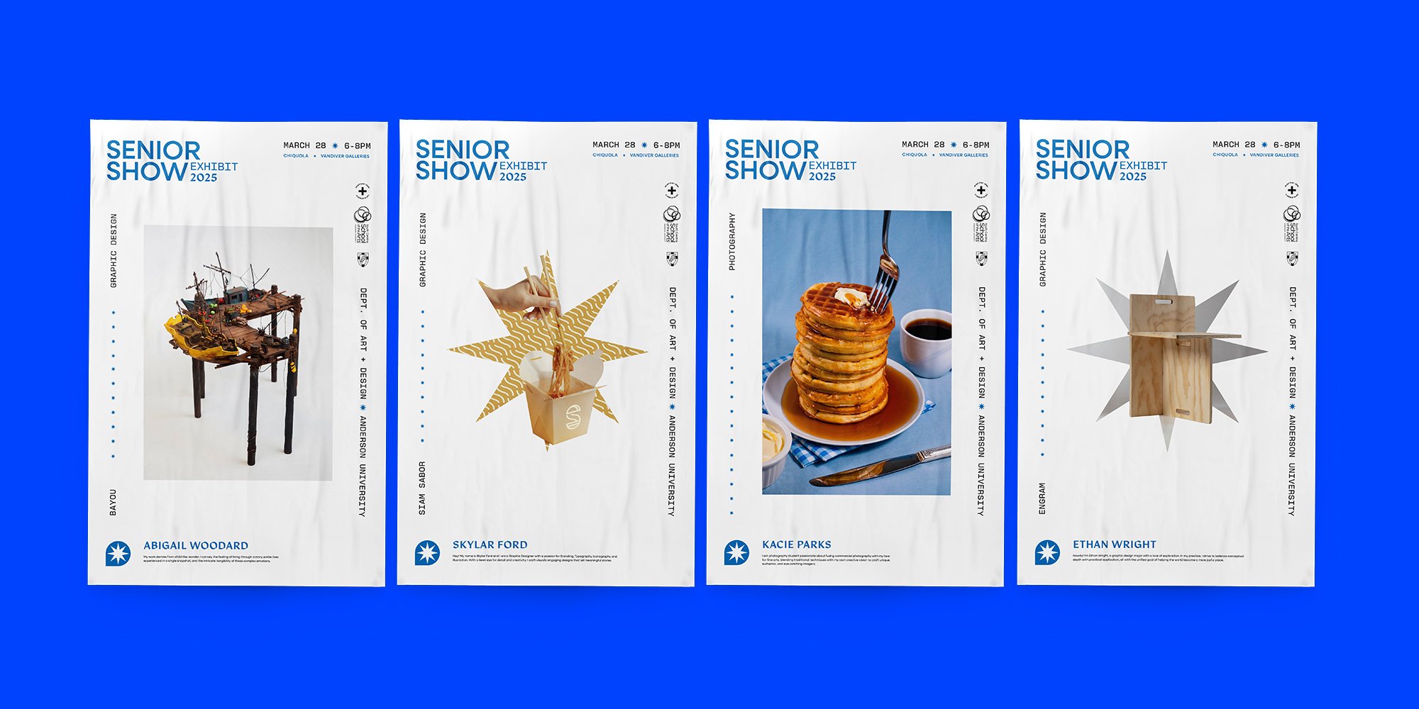
In order to reach specific external audiences, Senior Show required a refreshed and standardized approach that would be sustainable year over year, building brand equity within the local and regional community while at the same time activating attendance of the event. It was also important that the identity equally represented each area of study within the department, without overshadowing or distracting from the student work itself. Ultimately, the design should elevate the work and the experience of attending the event, feeling less like a student event and more like a professional exhibition experience.
Solution
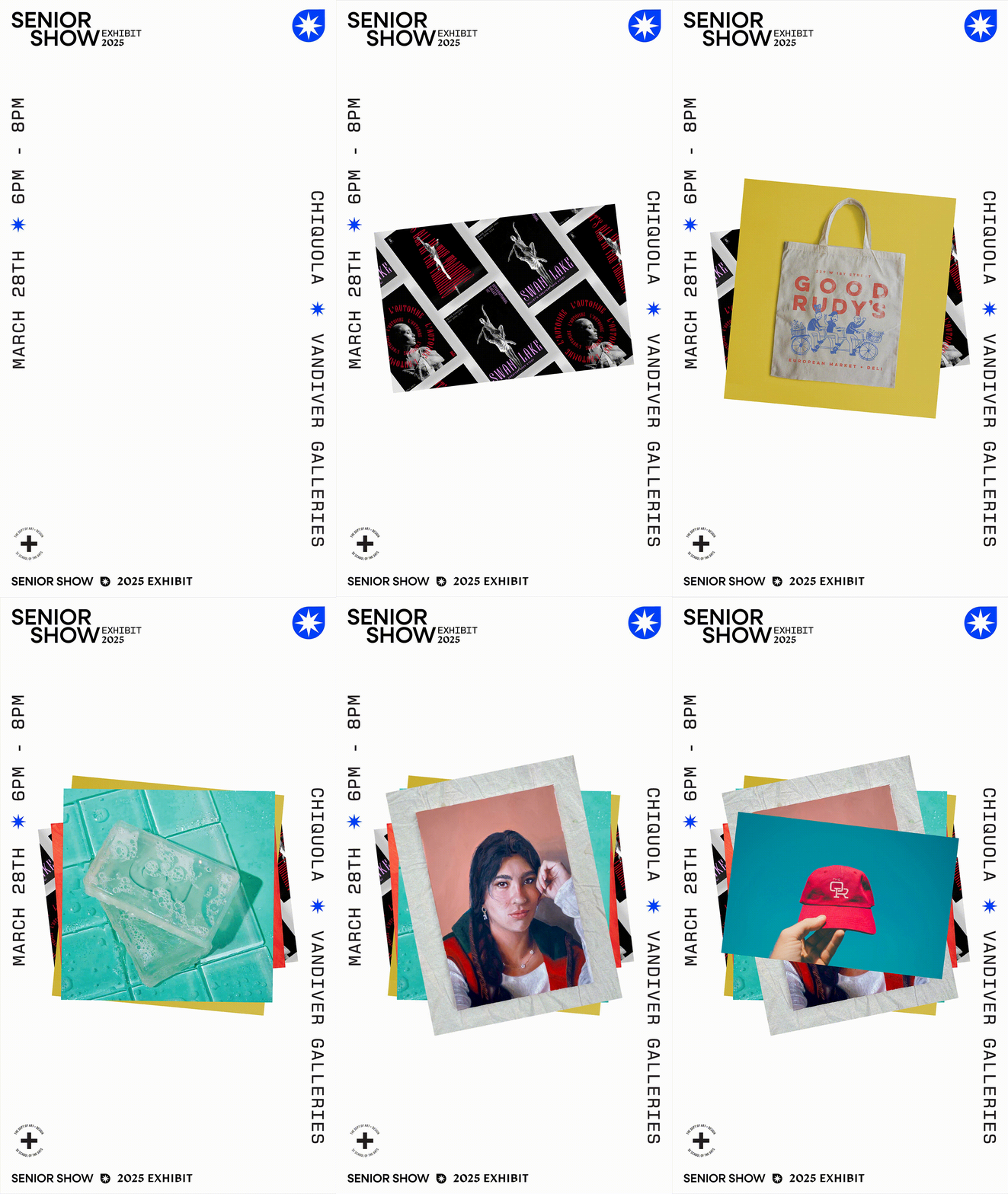
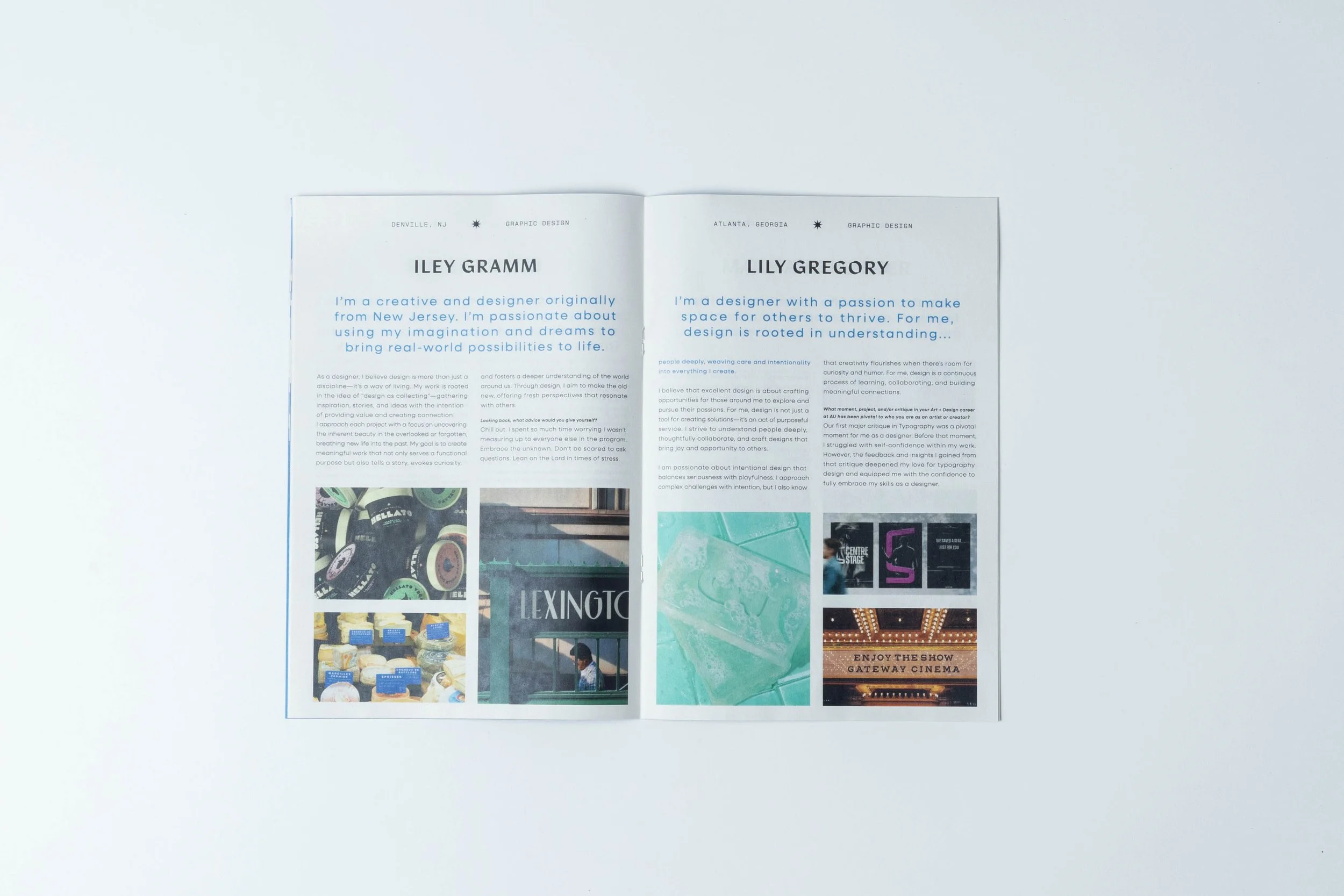
We crafted our typographic palette around legibility and neutrality, with small hits of visual interest. Additionally, the usage, rotation, and placement of the type across our materials would allow for visual intrigue to exist as well. The goal was for the typography to remain somewhat timeless across each year, while still being unique to our university.
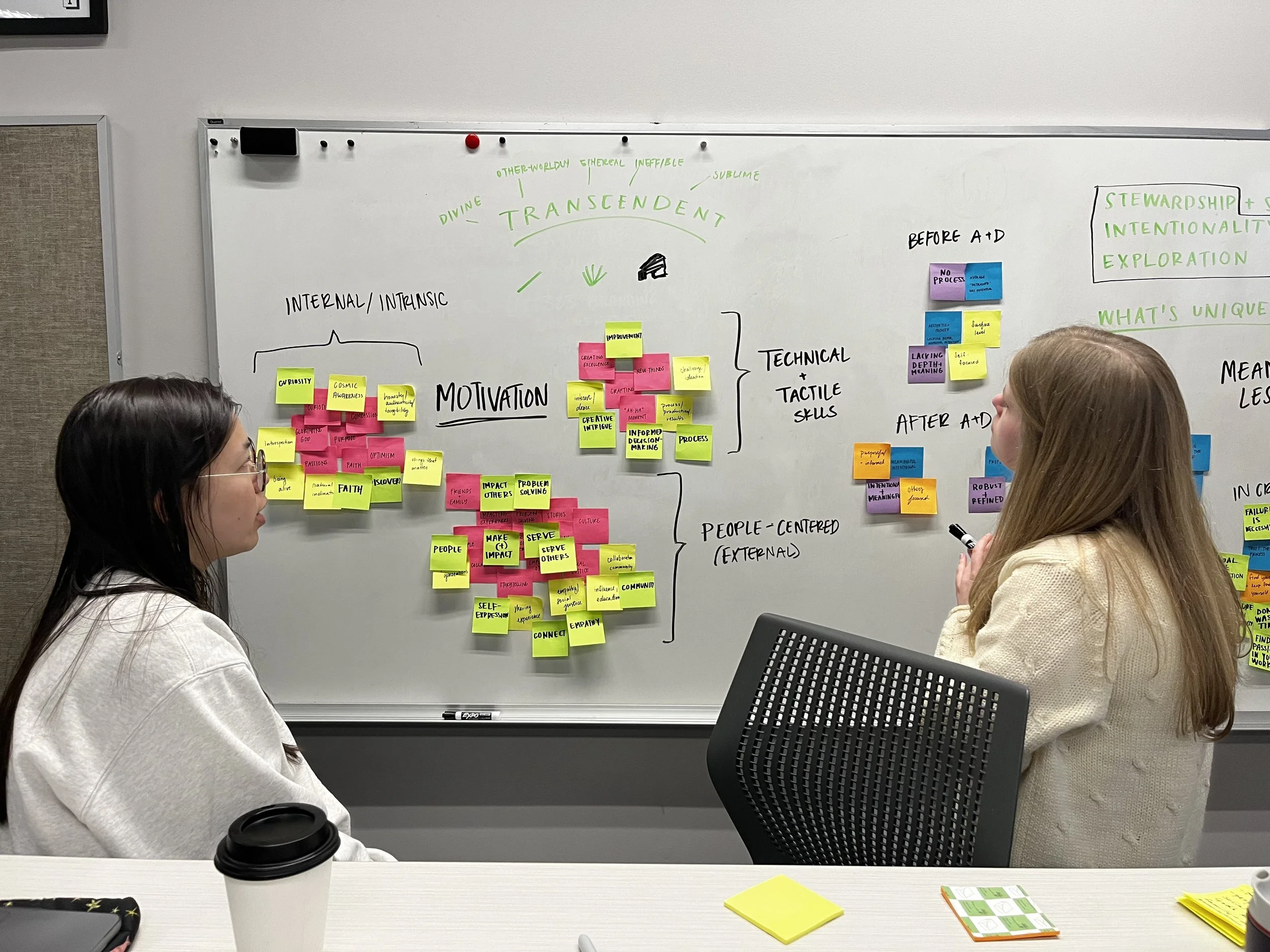
The final identity choices of our logo mark and brand color were based entirely on the senior survey. By crafting these elements to exist uniquely within each year’s identity, the design decisions were directly tied with the experiences of the graduating class. We found that seniors felt that their work had present-day impact and the potential for future cultural influence. We uncovered the theme of transcendence.
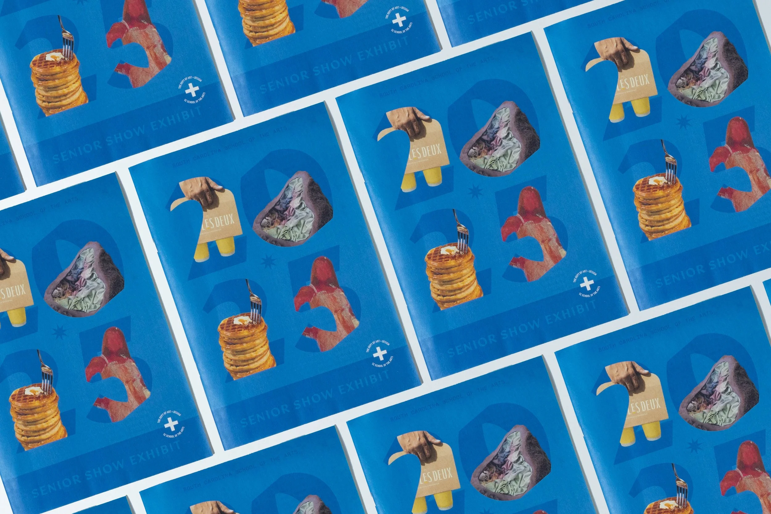
With this in mind, multiple iterations of logo marks were created, eventually leading to a dynamic yet stable mark. The star shape is energetic and expansive, but it exists in an inviting and grounded form. This, coupled with a striking blue, resolved the brand identity, making it ready to be applied to various marketing contexts.
The Brand
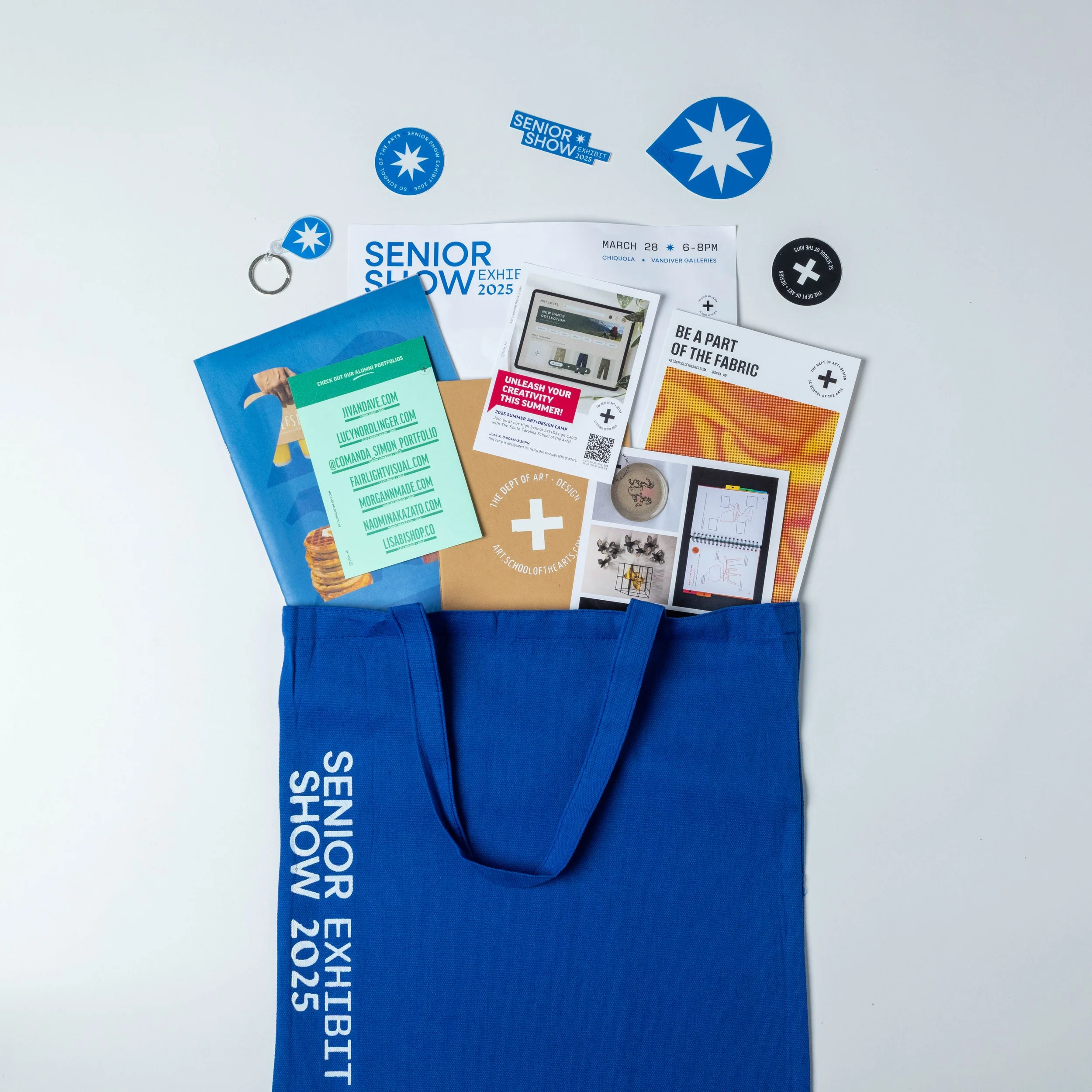
Overall, the final brand identity paired with unique marketing materials created an effective and memorable solution for Senior Show. The previous issues of inconsistency and unfamiliarity were resolved through a grounded yet engaging campaign. Reaching new and existing audiences, the refreshed Senior Show brand identity will offer further insight into all that our program has to offer, while simultaneously cultivating a sense of pride and celebration for graduating classes to come.
Results
Credits
Typefaces: Neulis Sans by Adam Ladd, Manofa from Inhouse Type Foundry, New Science Mono by Newlyn.
